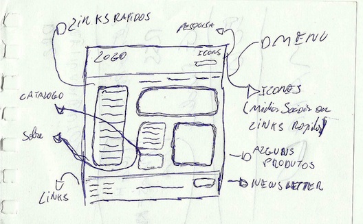
How to Create Wireframes for Your Website

 A website wireframe, also known
as a page schematic or screen blueprint, is a visual guide that
represents the skeletal framework of a website.
In other terms, it's a "sketch" of the web page or application that identifies different elements that needs to be displayed on the screen such as the content, navigation, images, or buttons, etc.
Wireframes can be as advanced as you need them to be; it really depends on whom you are presenting the framework to. They are not restrained to developers and designers anymore; as more and more clients are grasping the notion of wireframes, they are requesting it as a deliverable before kicking off the aesthetics work.
In fact, some companies and clients are using them instead of business requirements documents, which is much more exciting for a designer.
When creating wireframes, you must add annotations, which are simply notes explaining the elements on a wireframe.The trick is to keep writing clear and straight to the point so that it doesn't leave room for misinterpretation.
If you are asking yourself who would use the wireframe, other than the client, to approve the direction and the design for the aesthetic work, well, almost everybody in involved in the project does, from copy writers to quality assurance and project manager.
What do you need to create wireframes?
Essentially, you need the requirements of the application or website, the features, the site map, briefs, and notes about everything that has been discussed and approved. After gathering the information and laying everything out in a clear manner answering all requirements and objectives, you can start with the wireframes.
What programs should you use? Most will fire up Omnigraffle, Axure, Fireworks and start drawing. Just don't. Pick a good old stack of papers, a pencil, erasers and start drawing. Don't be afraid of mistakes, don't get discouraged when (yes, when, not if) your first draft of wireframes get rejected. Draw and draw again, share them with your team, and make sure that everything is aligned according to the briefs before sharing them with the client; this will save you a lot of time and frustration.
My final advice is that you don't need to sweat it with wireframes. I always prefer to make sure they look like sketches when drawing them, just to maintain a "blueprint" feeling and keep everyone focused on developing the core elements of the site.
The more polished the wireframe, the more they become a distraction from the task at hand, in my honest opinion. So keep it simple and don't be afraid to get your hands dirty with ink!


